Project_JvR
Interior design project – Lausanne – 2023
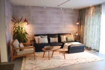
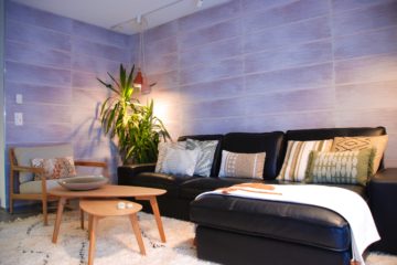
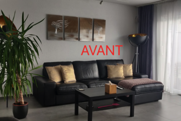
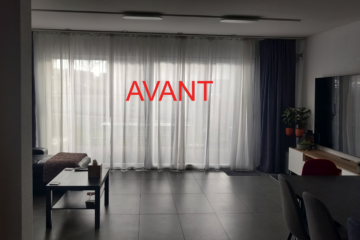
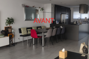
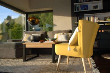
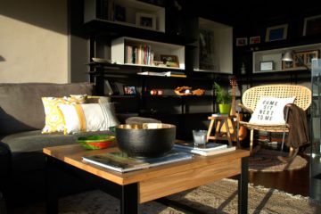
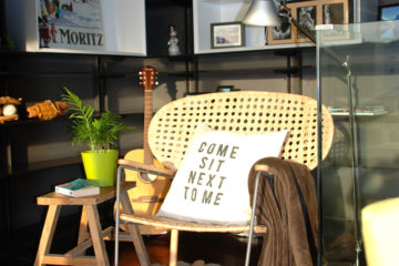
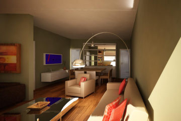
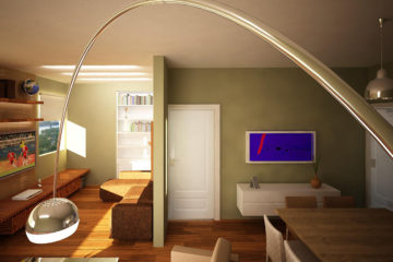
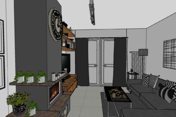
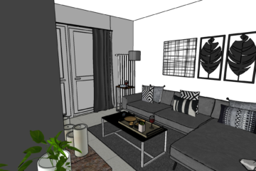
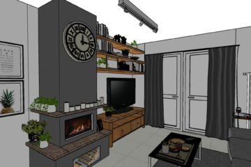
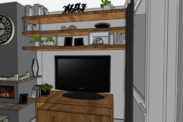
Decorating a living space for a couple from South Africa can be an exciting mix of styles and cultures. My clients wanted to transform this living space into a cocooning, harmonious space.
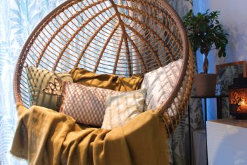
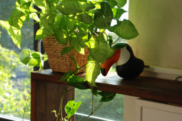
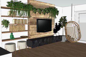
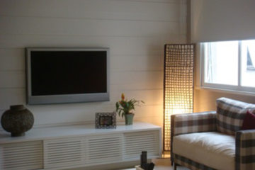
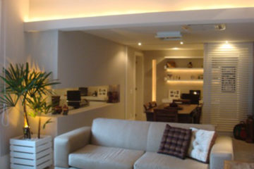
The presence of cold materials, such as tiles and metal, and the colors black and gray, meant that the living room wasn’t very welcoming. The idea was to warm up the room with the use of natural materials such as wood and rattan to bring an organic and relaxing atmosphere.
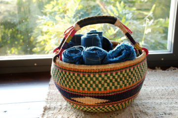
Tribal patterns and colours can be incorporated into furniture and textiles to add an authentic touch.
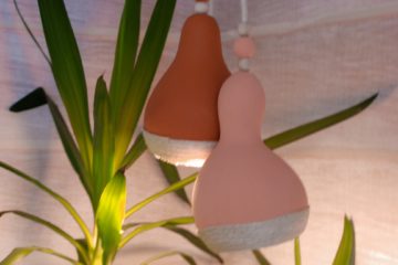
Atelier id proposed handcrafted objects for a unique look.
Project_Hair Salon
Hair salon project – Montreux – 2022
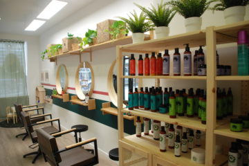
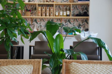
Studio Hairitage is a salon specializing in curly hair. The brand values naturalness, among other things.
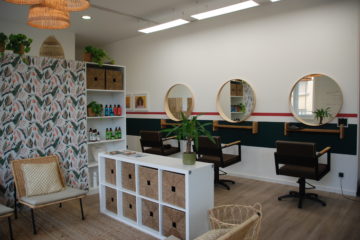
The objective of this project was to transform a commercial space into a hair salon while respecting the company’s values: ethics, innovation, dynamism and natural beauty.
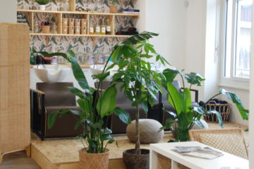
The brand’s colors guided the choice of materials. The wallpaper is in the colors of the logo and branding and was carefully chosen.
For my customer, it was important to bring freshness and youthfulness to the space. The lines on the walls graphically mark the space dedicated to haircuts.
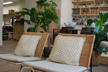
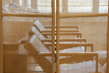
For the furniture, we opted for light wood and natural materials such as rattan and straw.
These materials create a pleasant, warm atmosphere.
Plants are very important to the customer, so we imagined a small urban forest.
Project_FT
In this interior design project the idea was to use neutral colours on the walls and large furniture and add colour to the space using objects.
The wall shelving system was painted in anthracite grey to mask the black cast iron shelving and put the objects and books on the spotlight.
The armchair and cushions set an identity to the decoration.
The high quality of the natural materials like jute, wood and metal bring comfort and a feeling of belonging.
The lighting project was planned to delimit functions and to change the lighting according to the different activities of the day.
Project_AA
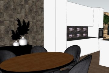
Apartment project – Geneva – 2021
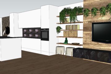
At this appartement the kitchen opens to the living room and dining room, so the identity of the room has to work out in a uniform way.
We proposed superb wallpaper for the dining room and a glossy credenza for the kitchen in the hexagonal shape of Moroccan zellige. The wall opposite the kitchen was painted anthracite grey and decorated with a big plant.
Decorative objects add a touch of color.
Atelier id designed a large bespoke shelving unit for the living room. Old wood gives character to this piece of furniture with its sober lines.
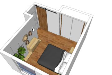
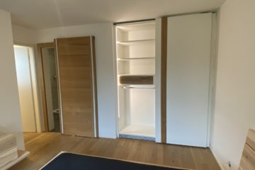
At the bedroom a wardrobe with automatic lighting and a sliding door with invisible system were made to measure.
Project_JE
An apartment renovation that originally had three bedrooms.
With the intent of creating a dining room and a home office, we opened one of the bedrooms to the living room. Sliding doors were used to separate these spaces without totally closing them.
A lighting project was developed to offer a cosy atmosphere into the space.
We reused the client’s furniture and mixed rustic and modern objects.
The bathroom project was completely renovated with black and white materials.
This project was done in collaboration with the architect Ana Paula Hygino.
Project_MP
In this project we worked with different textures inspired by Brazilian materials.
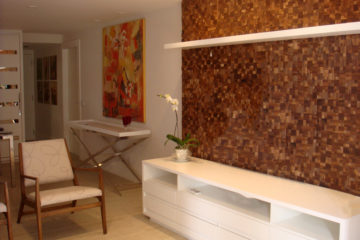
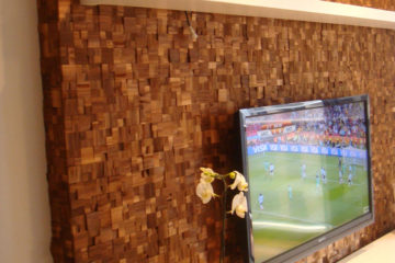
The living room wall was covered with coconut fibre.
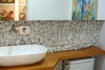
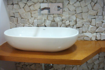
In the restroom, we used Portuguese stone on the floor- a typical stone that covers the sidewalks in Rio de Janeiro beaches. Customised countertop sink.
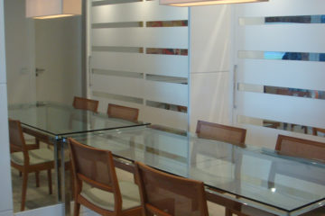
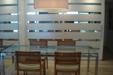
A large cabinet was designed for the dining room with details in mirror. For a visual effect we installed a mirror next to the dining table.
Lighting project developed.
This project was done in collaboration with the architect Ana Paula Hygino.
Project_SC
Perspective of an apartment’s renovation.
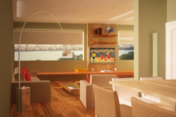
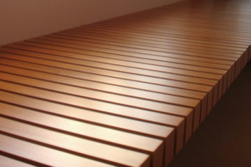
We designed a big wood bench below the windows to integrate the living room and the home cinema.
It was originally a three bedroom apartment and we opened one of the bedrooms to create the family’s dream: the home cinema.
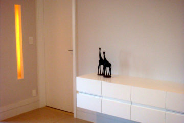
We developed the lighting project creating lighting niches.
This project was done in collaboration with the architect Ana Paula Hygino.
Project_JT
Consulting Décor Online project.
A relooking on the master suite and the living room.
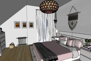
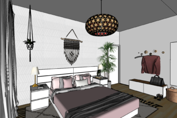
For the bedroom, we created a cosy atmosphere in light grey and rose.
An unused area in front of the walking closet now has a bench, a mirror and some hooks to make the routine in the mornings easier.
We chose decoration objects, photo frames, cushions, cover and rug.
We chose geometrical patterned wallpaper behind the bed with pastel colors to put the bed into the spotlight with gracefulness and harmony.
In the living room, we maintained the base colours and chose some furniture to go with the client’s existing ones.
Decoration objects, photo frames, cushions, rug and lighting were chosen to complement the space.
The wood shelving was designed to match the existing tv furniture.
Projects_SDB
Project_MP&OA
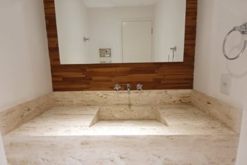
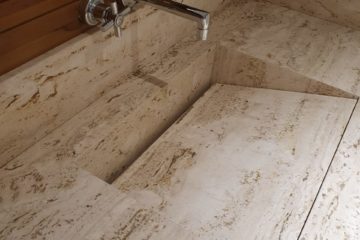
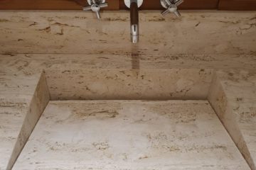
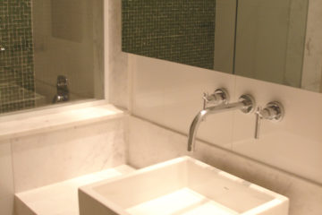
This restroom was planned from zero in a duplex penthouse apartment in Rio de Janeiro. The goal was to bring comfort to this lounge area. We chose natural materials like marble and wood. The sink was designed and sculpted into the marble. The sink cabinet with two big drawers is suspended to bring lightness to this small space. This project was done in collaboration with the architect Ana Paula Hygino.
Project_EC
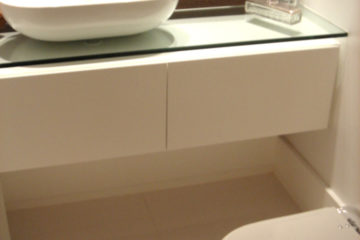
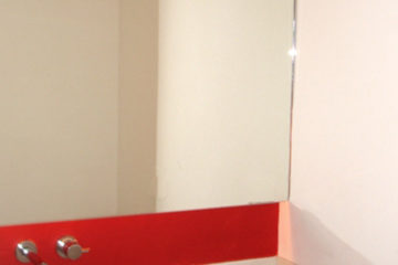
Restroom renovation. Before and After. Glass countertop, customised sink cabinet and sink. This project was done in collaboration with the architect Ana Paula Hygino.
Project_GM
Restroom and Bathroom renovations. Before and After. Detail of the glass countertop and sink.
Project_Baby Room
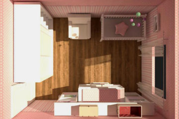
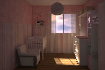
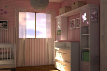
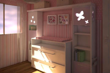
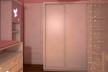
Baby room project. It is very important to think about flexibility and modularity when planning a baby room.
The changing table is over the chest of drawers and can be removed when not used. In the future, it will turn into a desk without any changes to the shelving structure.
The shelving has butterflies niches with indirect lighting to bring comfort to the baby. At the bottom, there are two practical drawers with wheels to help tidy up toys.
On the side of the shelf, there is room for books at reach.
All these considerations are useful and were thought to bring security and functionality to the everyday life.
